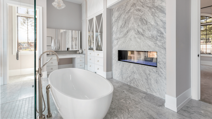
More than any other room in your home, the bathroom needs to be properly prepared to stand up to all sorts of abuse like dirt, spills, and of course, humidity. As we all know, this calls for one popular material: tile! The bathroom, of course, isn’t the only place you might consider putting down some tile. Kitchens are another popular space for tile.
While most of the spaces incorporating tile are likely going to be the same rooms in the house, generally speaking, this certainly does not mean that all tile layouts have to look the same. There are plenty of ways to set your tile apart with both classic and modern takes. Here are 5 of our favorite tile designs.
Love the Drama
The all white all tile layout for bathrooms and countertop backsplashes are perfectly fine and work great—but they’re a bit tired. They aren’t particularly exciting, and just about every bathroom in your memory has the all-white look, whether your memory is accurate or not.
How do you avoid this tired, bland look? Bring in the drama! Dark, deep, bold colors will make your tile design an experience. A deep crimson backsplash or a dark emerald green bathroom wall is sure to leave an impression.
One Size Does Not Fit All
Another way the usual white tile layout tends to come across as somewhat boring is its uniformity. Now, don’t get us wrong, uniformity can certainly be a great look, but white square tiles lined up and down don’t exactly scream creativity.
Steer clear of this by simply varying tile sizes! This can mean choosing a repeating pattern that incorporates tiles of different shapes or sizes or adding a bit of visual motion by laying down a more dynamic pattern. Whether you choose to add some color or not, this will definitely be more attractive than the same old whatever by whatever white square layout.
Classy in Black and White
Of course, another way to add a little style other than varying sizes of tile is adding variety in color. Color choice can be a pretty touchy subject, but if you want to keep it simple and classy, there’s a pretty easy option.
Black and white are classic and timeless, from the usual chessboard to more complicated designs. Especially if you’re not comfortable with risking bolder choices, rest assured that black and white is classy, tasteful, and stylish.
Mix and Match
If you’re really comfortable going for something bold and can’t decide on a single style, we have good news. It can look great to mix and match!
Now, this doesn’t mean just throw different random patterns and colors around—although that would certainly be quite a bold choice, too. Rather, laying out different styles and patterns in a design that is meant to bring them all together can be a great way to add quite a flair to your space.
Modern and Matte
We’ve mentioned classic, classy, and bold. We’re missing modern—but we haven’t forgotten about it! If you’re looking for a look that is bold and classy while also being irrevocably fresh and modern, matte tiles might be the choice for you.
The lack of gloss in a bathroom or kitchen setting might not feel familiar at all, but then again, that’s what makes it feel fresh.


